Chenyi Wang
Subway Navigation
UX Design Research
2023.11 - 2023.12
The topic problem picked by our team is Subway Navigation. During the process of primary and secondary research, we found a lot of interesting facts and insights from various perspectives. By mixing our own experience and the input from our key stakeholders, commuters, we decided to intervene and improve the signage for the NYC Subway station.
During the research process, we used observational studies and interview methods. For observational studies, we applied the self-report and controlled observation methods. Our interviews were mainly unstructured because we wanted to give stakeholders more space to express their opinions, which would help us gather more feedback and gain a deeper understanding of our stakeholders.
In interviews and observational studies, it was found that interviewees shared a common concern about the confusing navigation caused by the current signage in the NYC subway system. Many prefer using Google Maps over relying on the existing signs due to their ambiguity and complexity. Observational studies highlighted difficulties, especially for foreigners, navigating the extensive and intricate NYC subway system. Given the system's age, size, and complexity, addressing all reported problems is deemed impossible. The proposed solution is to prioritize redesigning the signage, as the most efficient way to improve the overall navigation experience in the NYC subway system.
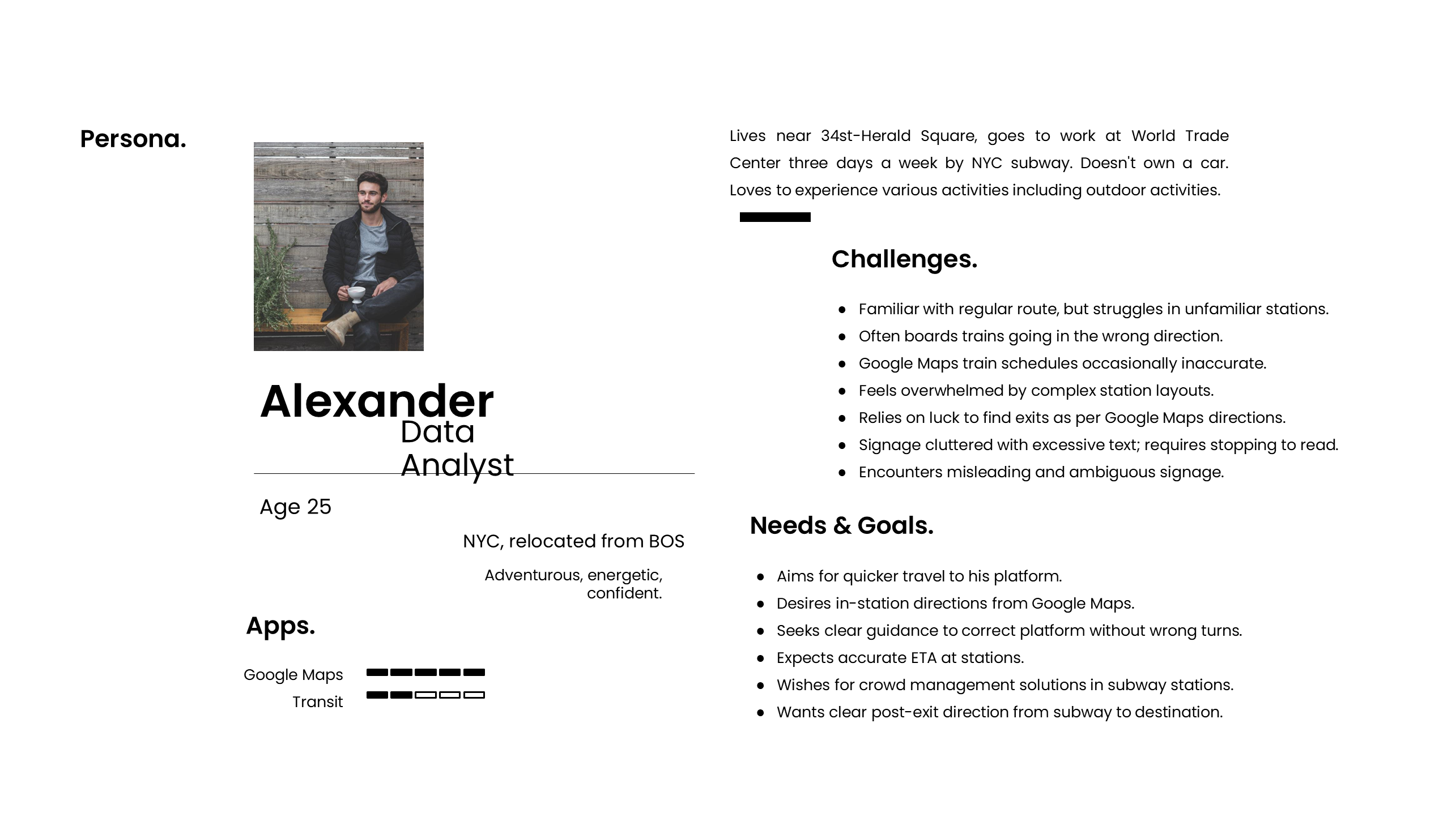
Based on our primary research, we summarized a user persona shown below:
User journey map:
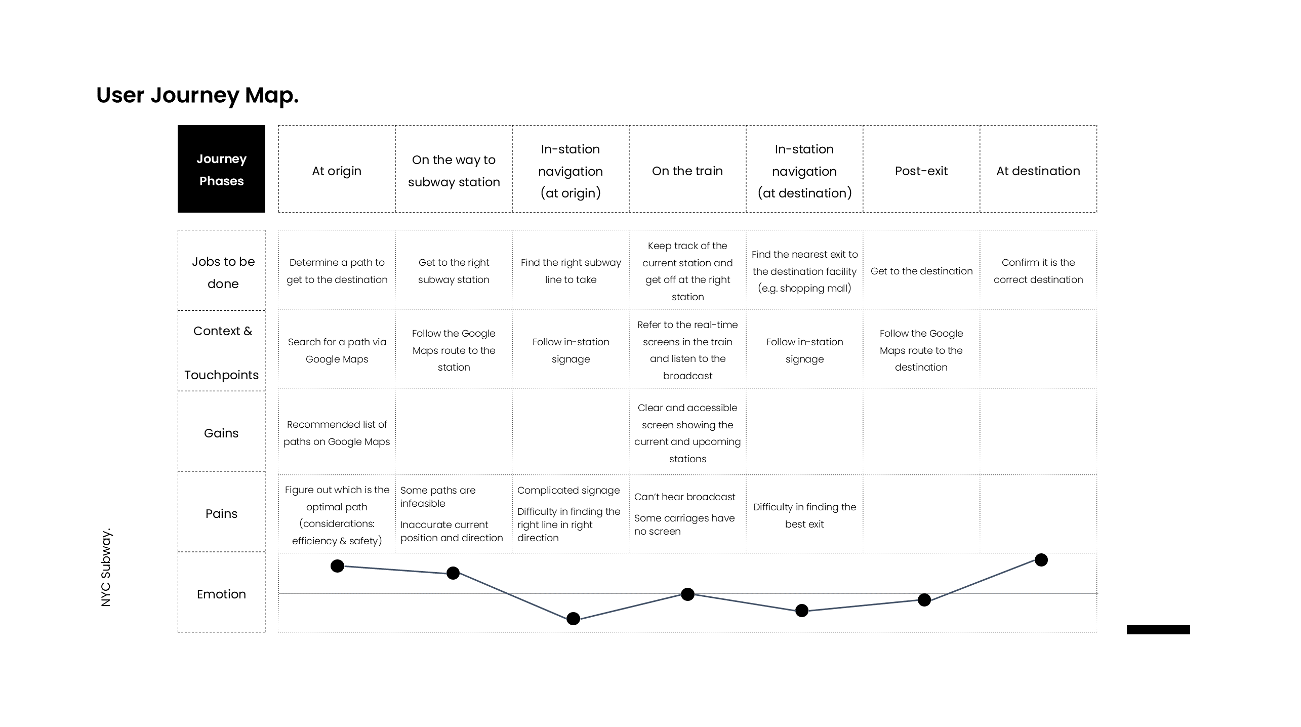
There are 7 phases in general in his journey from origin to destination. From the emotion map below, we can see that the biggest problem lie in the in-station navigation. Therefore, it leads us to focus on improving the in-station navigation experience.
Based on our research, we summarize four aspects of user needs from the NYC subway system: clear, accurate, intuitive, and accessible information. Our new design followed these four words to improve the subway signage so that they speak for themselves.
For our intervention, we picked one specific subway station, 34 St - Herald Square station. The reason why we picked this one is it has a unique architectural structure. It has 3 floors, 14 exits, and 8 subway lines. We think it is an appropriate case for us to practice the new signage as it uses a mix of ramps, stairs, escalators, and elevators.
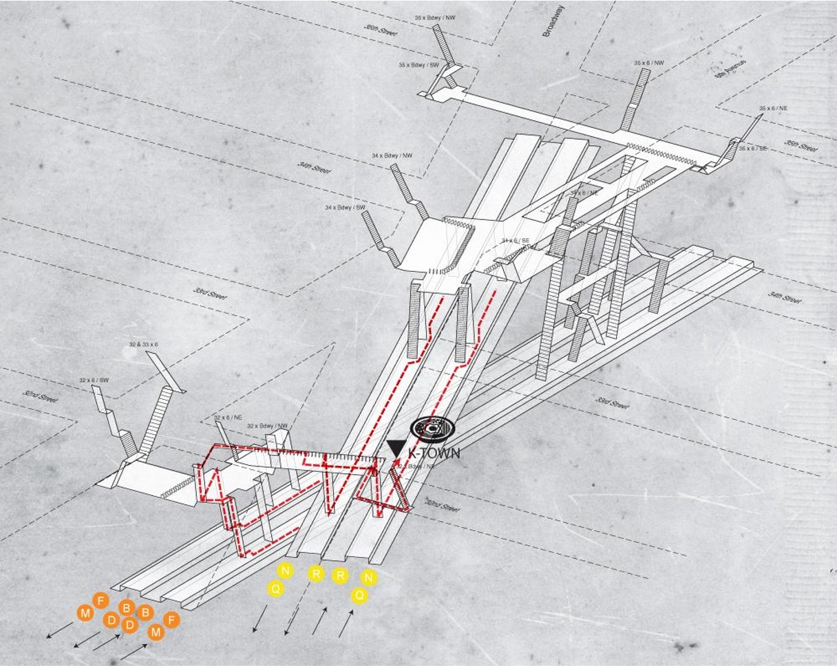
Street – Herald Square Station 3D Layouts from Project Subway NYC by Candy Chan
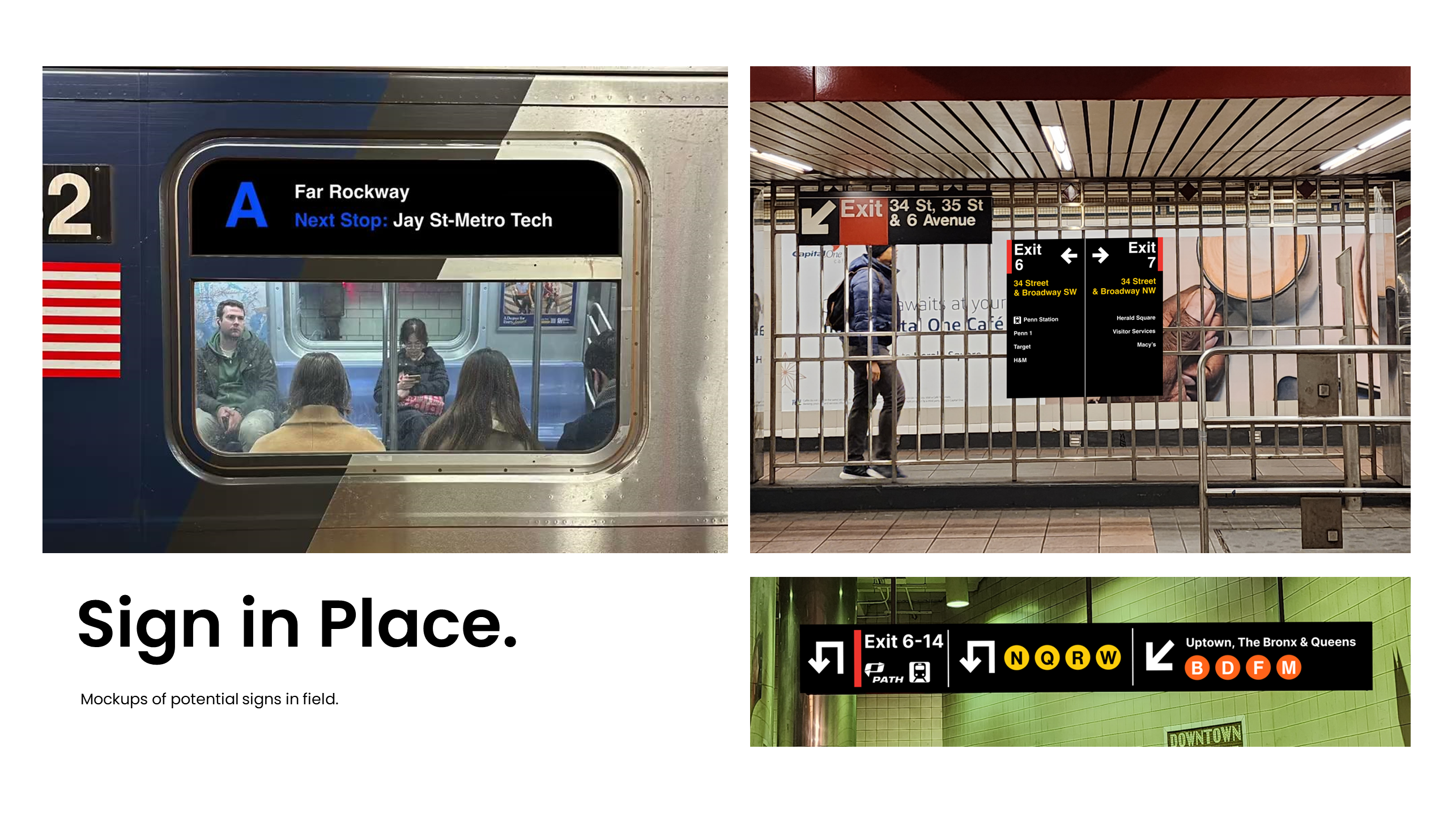
Initial version of redesign:
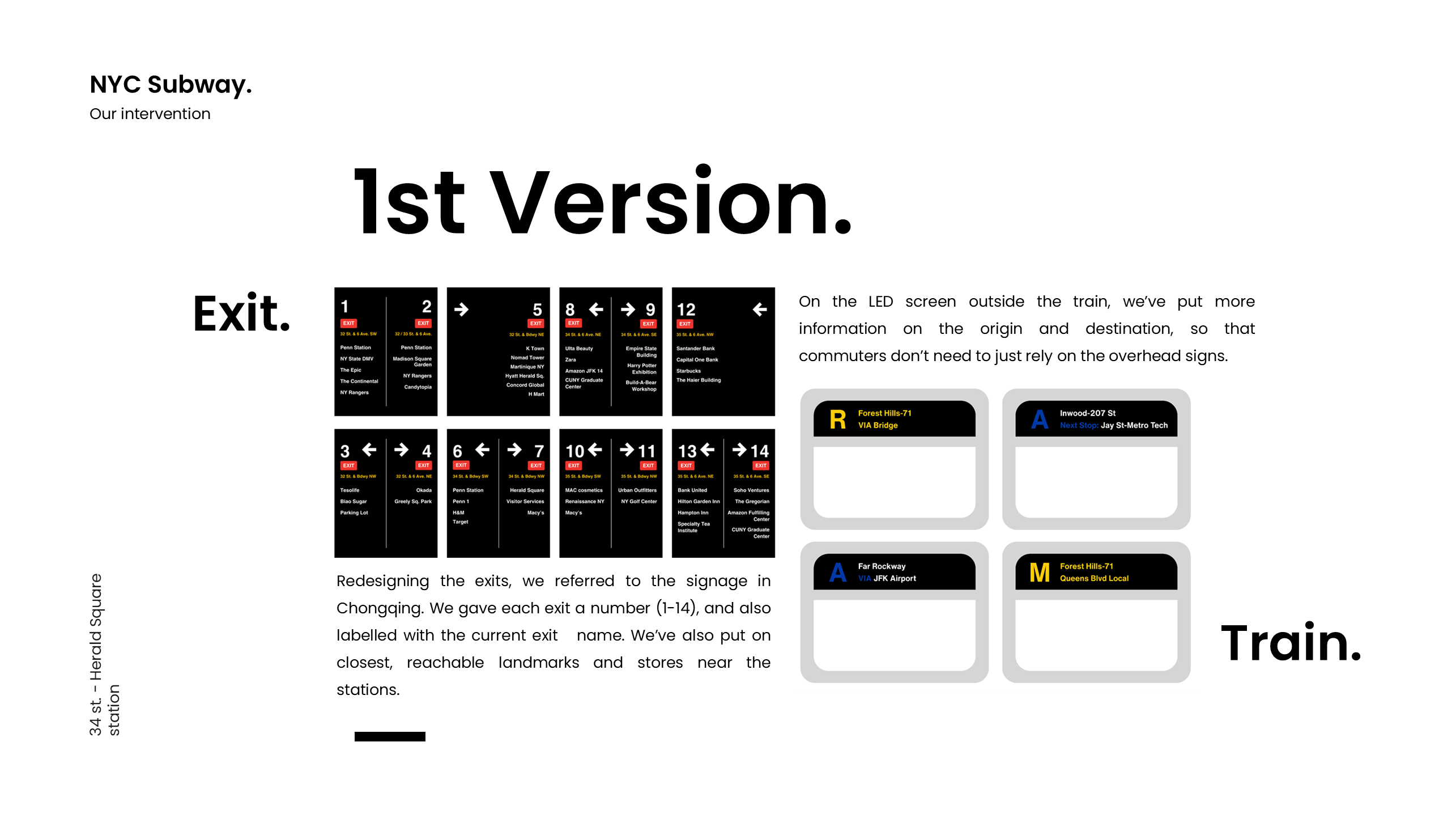
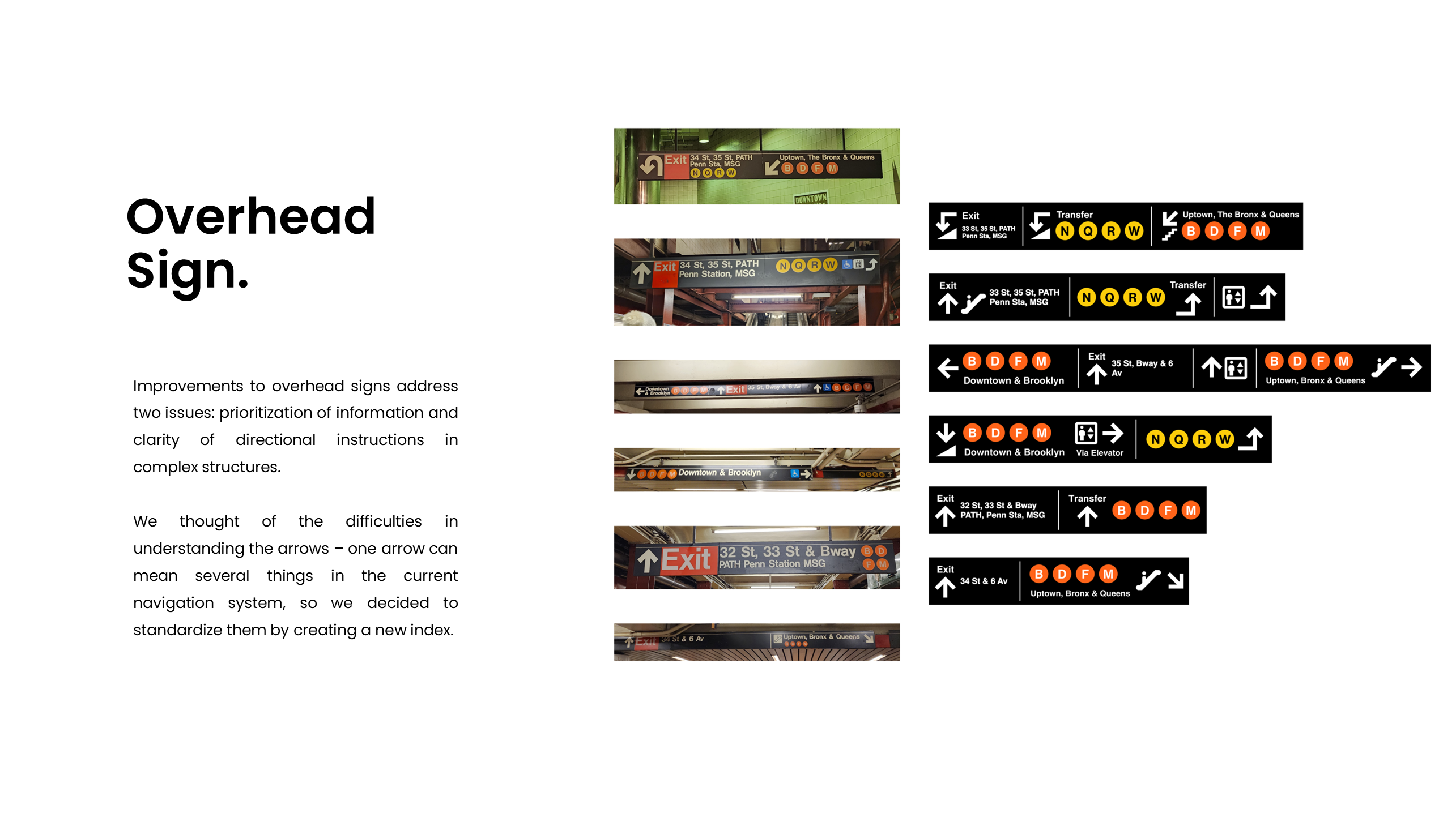
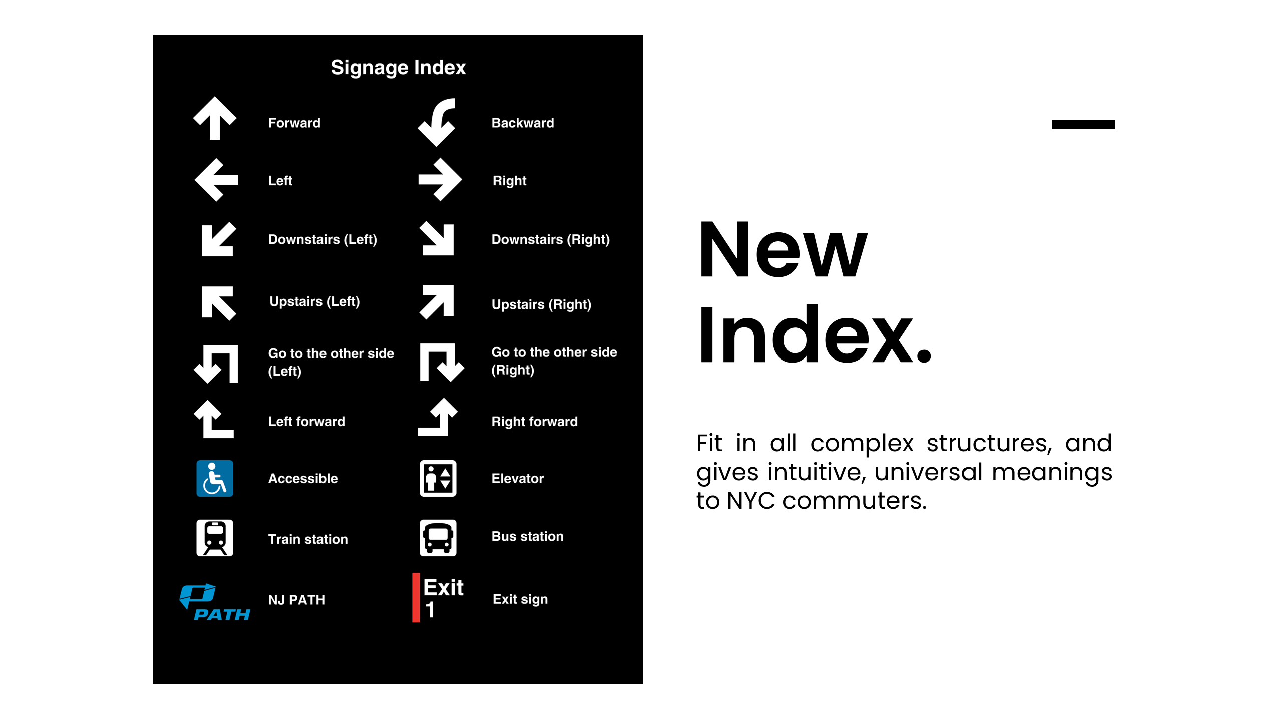
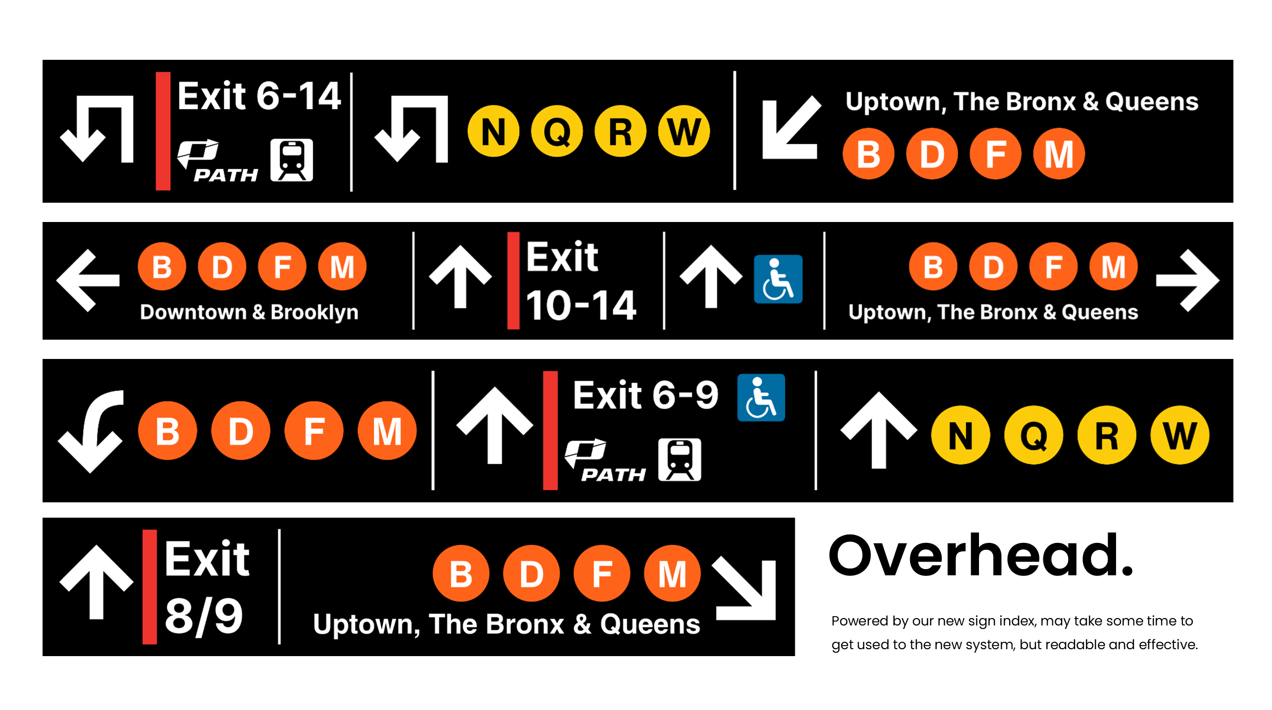
We noticed that some of the signs are ambiguous, like the down arrow, which could mean go downward or go backward depending on the situation. So we decided to standardize the symbols by creating a new index system.
Then, we created a 2nd version for the exit and overhead signs and applied the new indexes we just created.
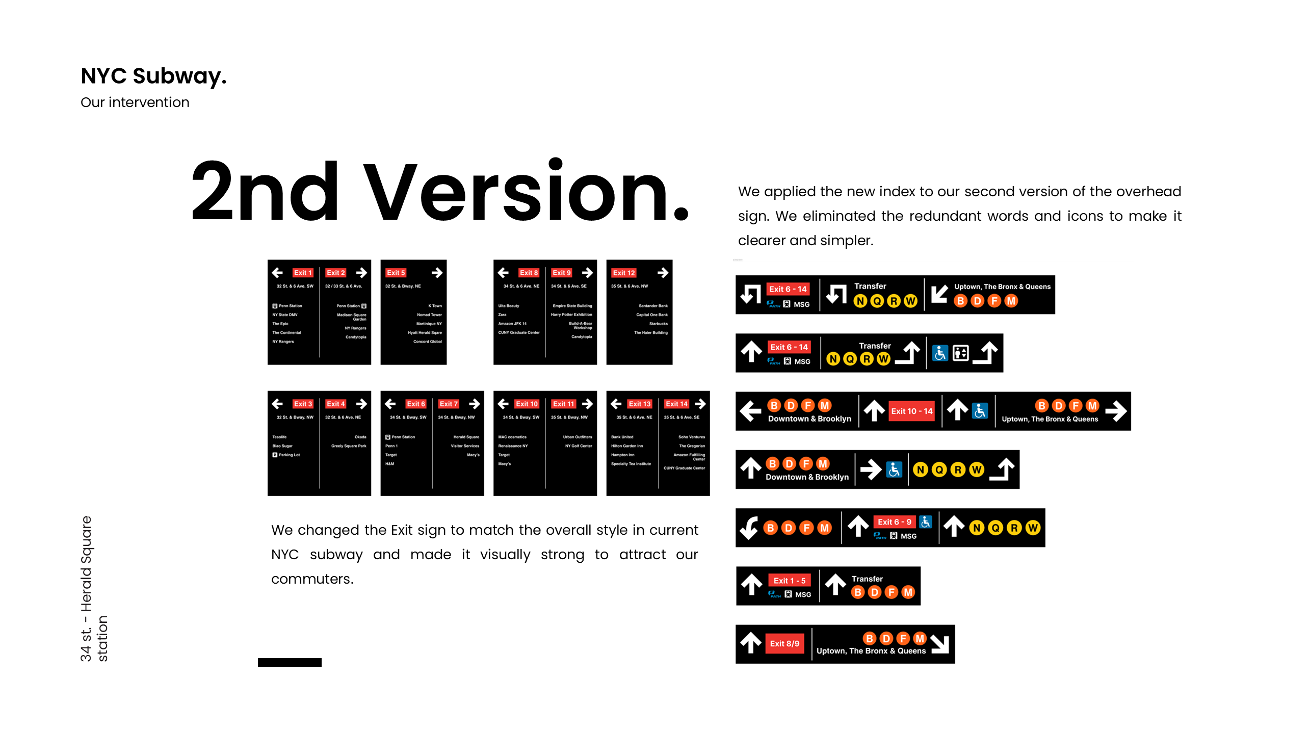
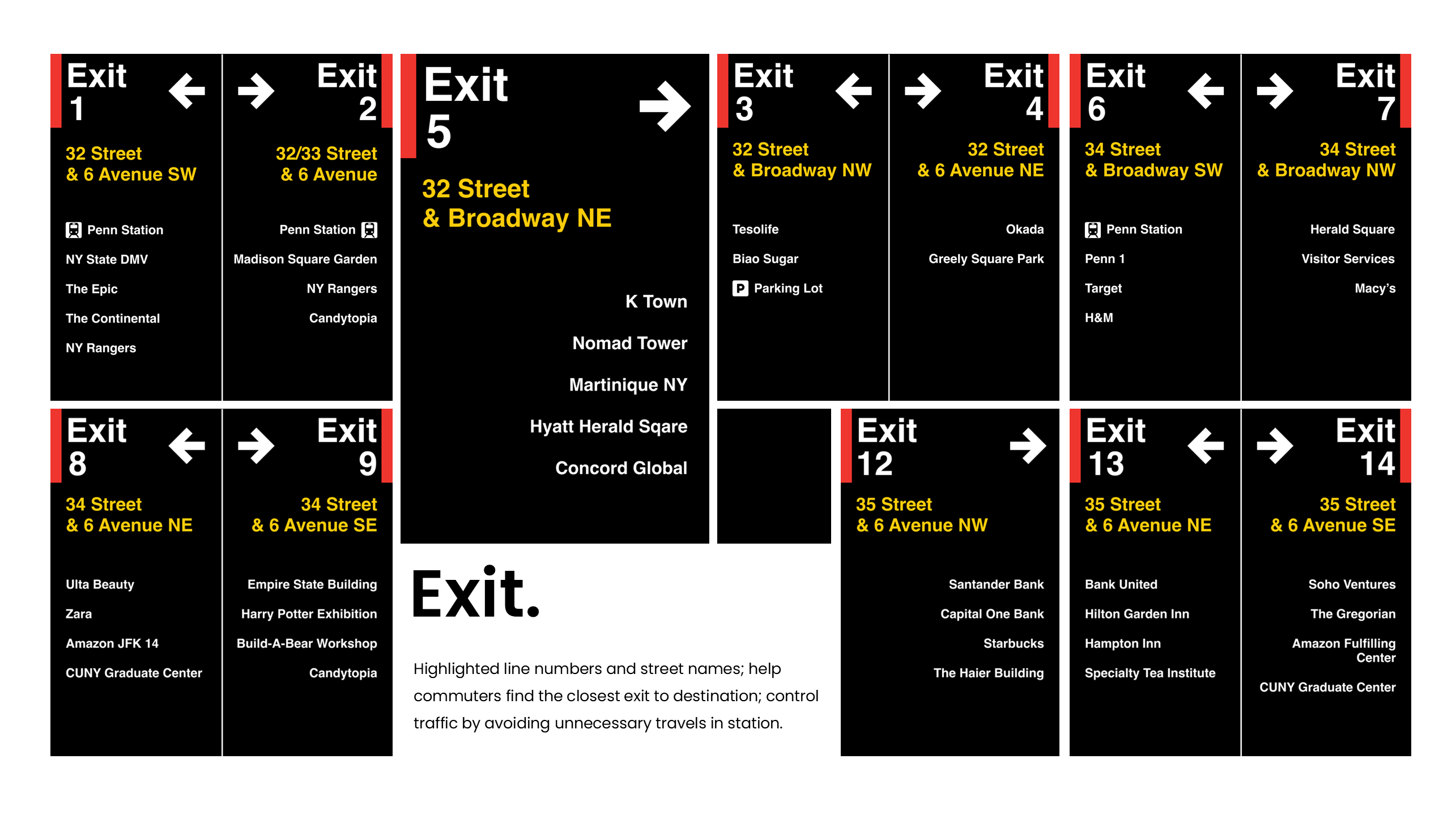
We made the exit signs visually strong to attract commuters and combined the exit number with the word exit to differentiate it from the subway lines. For the overhead signs, we eliminated the redundant text and symbols by applying the new index to make it easier to read. We also think it is actually better to keep the sign simple because, in the actual station, there are a lot of signs along the way guiding you toward where you want to go, so it is not necessary to make one single sign too detailed.
After the redesign, we conducted A/B tests using the second version and the current design to test effectiveness and clarity after the improvement. We asked our participants to interpret the meaning of two different signs and leave us feedback after the process.
For the exit sign, currently we can see those simple exit signs with only road names on them. Our participants liked that the exits are numbered based on the geographical location, and also list the nearby buildings names. Feedback suggested enlarging the text for better visibility from a distance.
Our final iteration includes feedback from our A/B tests. We emphasize user-friendliness and aesthetic coherence. We've transformed not just the look, but the utility of these signs, making them more intuitive and accessible. We redesigned the exit sign and number to differentiate it from the line names. We’ve also highlighted the road name in bright yellow to keep the current rules and habits and make them visible in distance.
The subway sign is more than a design but is a service in public spaces. We put our emphasis on analyzing user behavior and understanding users’ needs before and during the design process.
Overall, our project demonstrates a methodical and practical approach to reimagining a key component of urban infrastructure, integral to daily life experiences. It addressed the complexities of NYC subway signs, offering effective, inclusive, and long-lasting solutions. Our design aligns the NYC icon with modern sign languages and human habits, and we underscore its relevance and utility in contemporary urban settings.
Tools: Figma, UX research methodologies
In collaboration with: Cassandra Mao, Fuguo Xue, Rolly Gu